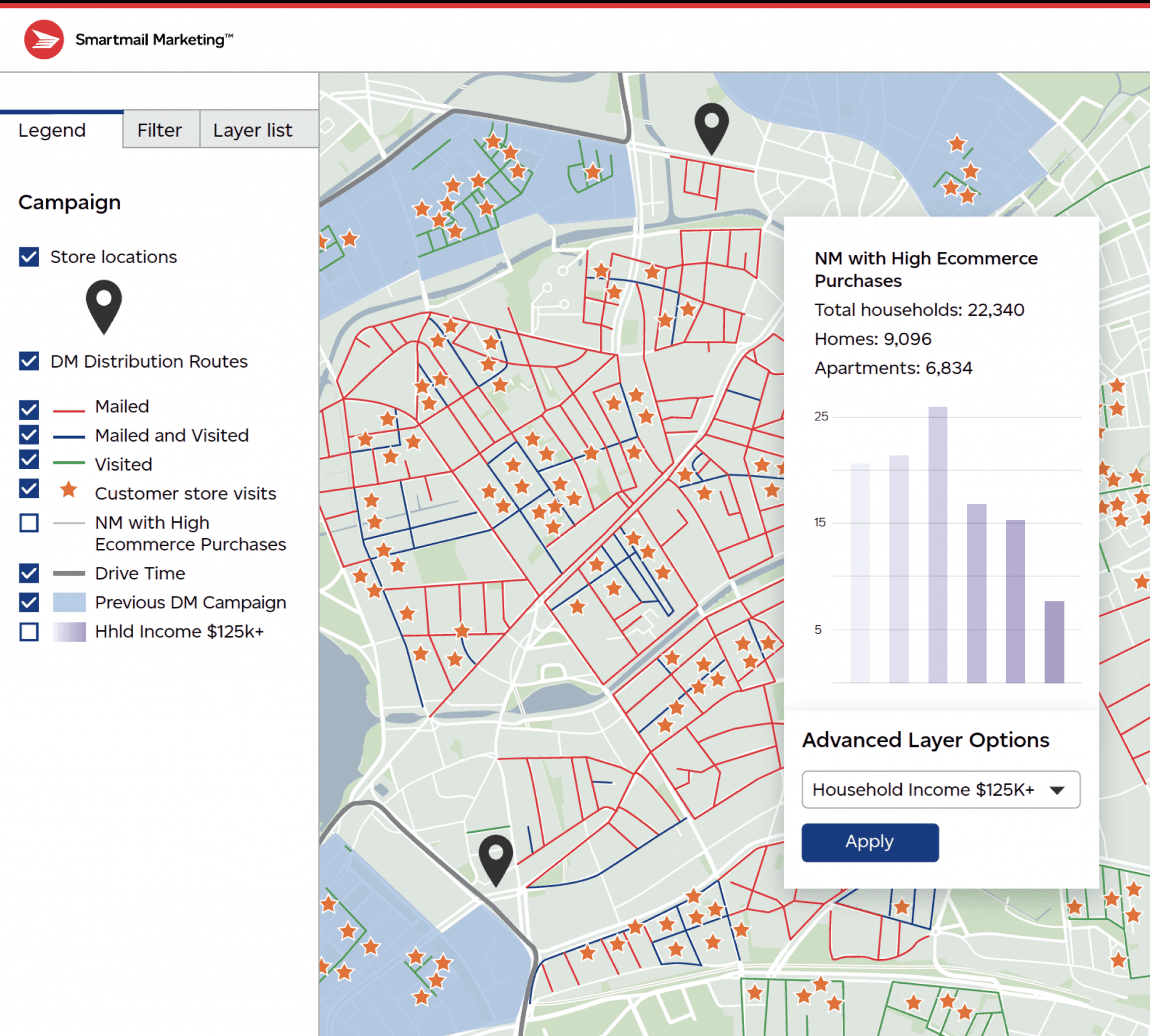
The data is everywhere, but it’s what you do with it that can make it valuable. Using data visualization, you can transform data from figures on a spreadsheet into valuable visual insights that can help you develop effective strategies to optimize your next campaign.
What is Data Visualization?
Data Visualization is when your customer data is layered with other data sources onto a map to visually see geospatial patterns, outliers, and opportunities. Different data can be overlaid to uncover new insights, including previous campaign results, store locations, key audience characteristics and more. You can even include information about your competitors to help develop strategies for new campaigns.
Example:
A retailer has 6 locations in the GTA area. Existing customer data is overlaid on a map to see where customers are in relation to the six locations. Another layer shows where previous mail campaigns were sent. Competitor data is another layer. Analyzing the layers of data will show opportunities for new campaigns, as well as areas that may need redirection.

Data Visualization is a specialty service available through Canada Post. As a Canada Post Smartmail Marketing Expert Partner, we work with you and Canada Post to maximize your campaign results.
When you work with an Expert Partner like AIIM, you get access to expertise and seasoned advice from our past experience and successes. We know how to optimize your list, build new lists with your target prospects, and strategize for the best results.
Click here to learn more about our direct mail services
*Right now, the Data Visualization tool is only available for Neighborhood Mail.
Canada Post’s Case Study:
Further resources from Canada Post about Data Visualization:
https://www.canadapost-postescanada.ca/blogs/business/marketing/mapping-your-way/